✨ Dispersion every result, one dot
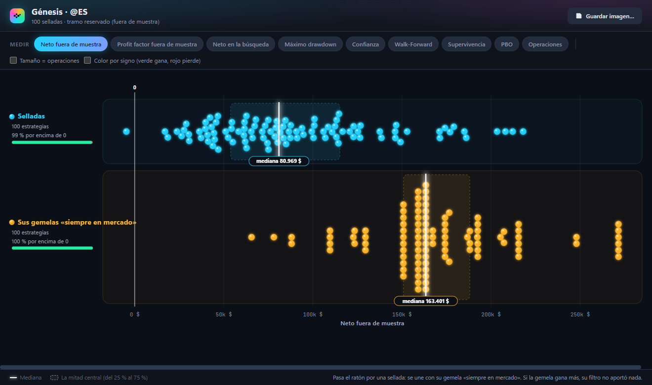
Almost everything AniQuant does ends in a table sorted from best to worst, and a table like that hides the most important thing: how the results are spread. Is the best strategy surrounded by others almost as good, or is it a lonely dot that got lucky? Does what works in sample keep working out of sample? The Dispersion chart shows it at a glance: every strategy, variation, cycle or edge is a dot, and the dots are grouped into rows that can be compared with each other.
It opens with the Dispersion button in nine modules: AQ Genesis, Survival Test, Strategy Lab, Walk-Forward, Edge Library, Portfolio, Edge Scanner, Pattern Miner and Stocks Backtest. It appears in a separate window, which you can leave open next to the module or move to another monitor. Press F1 in it and the help opens at the part about the module it came from.
How to read it
Each dot is one result, placed from left to right by the chosen metric. When several land in the same place they stack without covering each other (a «swarm»), so the height of the cloud shows where they concentrate. Hover over one to see its full card.
Each row is a group with its own colour: the sealed strategies and their twins, everything tested and the ranking, what the search sees and what it does not… On the left, its name, how many dots it has, what percentage lies above zero and a small green and red bar with that split.
The glowing white line is the row's median: half the dots lie on each side. The dotted box marks the middle half, from 25% to 75%. A median is not dragged along by one extreme result, which is exactly what the average does.
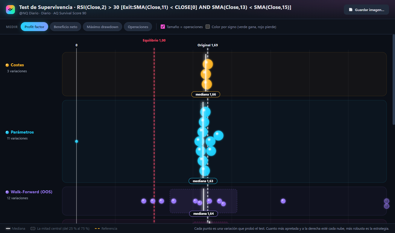
Dashed lines that give context: Break-even 1.00 on the profit factor, Original in the Survival Test, the Chance bar in the Edge Scanner, Coin toss at a 50% win rate… And a thin line at zero.
If a result is so extreme that it would squash all the others, it is drawn at the edge, with a dotted outline, and the bottom right says how many there are. The scale fits the majority, not the outlier.
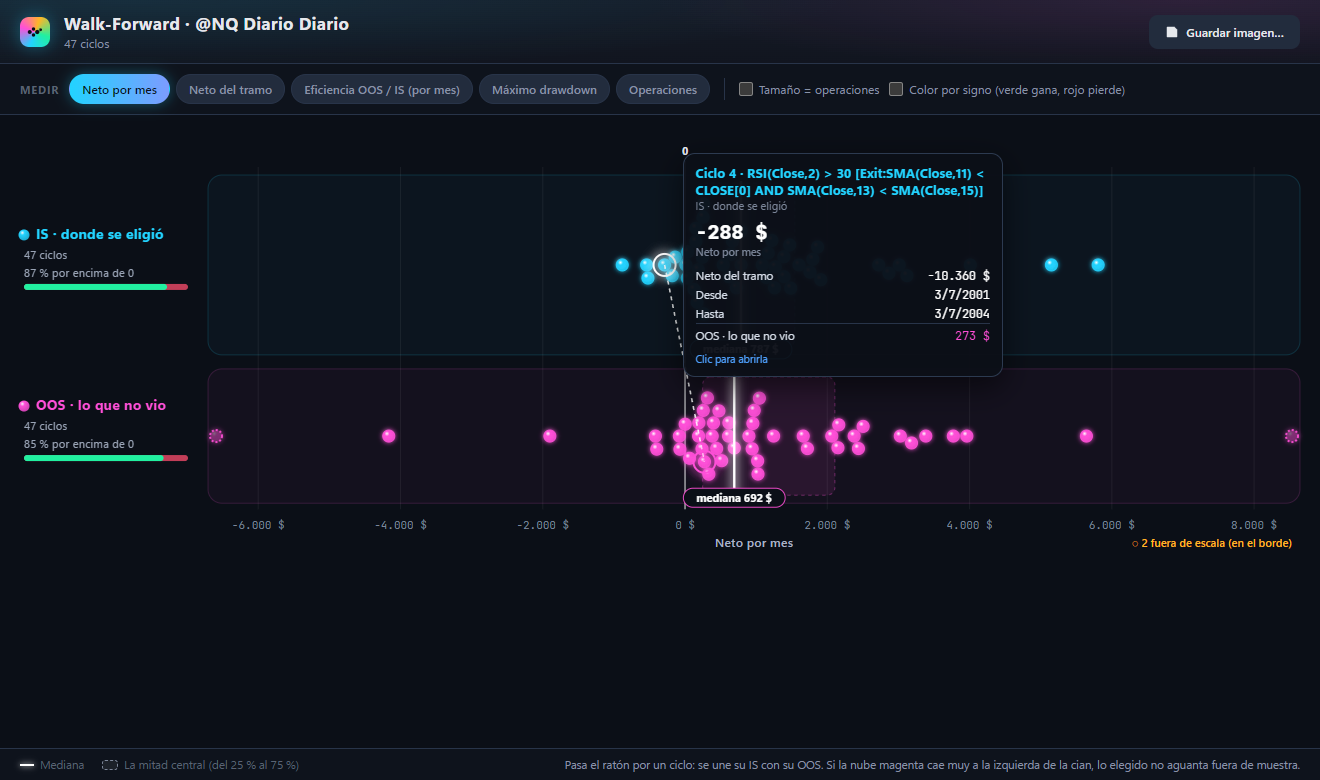
When the same result appears in two rows (a sealed strategy and its twin, a cycle in its search stretch and in the one it never saw), hovering over one joins them with a line. That shows, case by case, how much it changes.
The controls
The buttons at the top choose the metric: net profit, profit factor, drawdown, trades… Each module has its own. When you switch, the dots move with an animation, so you can follow one with your eyes. The window remembers the last metric used in each module.
Turns the dots into bubbles: the bigger, the more trades (or signals). It stops you trusting a brilliant result that comes from very few trades.
Paints each dot green if it wins and red if it loses, instead of its row's colour. Useful when there is a single row, as in the Pattern Miner.
In the modules that allow it, clicking a dot selects that result in its own window (the strategy in the Genesis Hall, the edge in the gallery…). Save image… exports the chart to PNG, exactly as you see it.
Three shapes worth recognising
A cloud that is tight and to the right: many variations give a similar, good result. The idea has substance; it does not depend on fine tuning.
One dot far to the right and the rest piled up near zero. What tops the table is probably the luck of having tried many things.
If the row of what the search never saw (out of sample) falls far to the left of the row of what it did see, what was chosen does not hold up on new data.
Module by module
Dispersion button in the Hall header. Two rows: the sealed strategies and their «always in the market» twins (the same exit, but entering on every bar, with no filter). Metrics: out-of-sample net profit and profit factor, net profit in the search, max drawdown, Confidence, Walk-Forward, Survival, PBO and trades.
What to look at: hover over a sealed strategy and it joins its twin. If the twin makes more out of sample, the entry filter added nothing: the market was simply rising. The window updates itself every time Genesis seals a strategy, and clicking a dot selects it in the Hall.
With no held-out period, there is only search data: the window says so. In evaluation mode, hidden strategies appear as «TRIAL».
Every variation the test tried is a dot, and every phase is a row: costs, parameters, Walk-Forward, periods, Monte Carlo, markets and timeframes. The dashed white line is the Original strategy; the red one, the profit factor's break-even. Metrics: profit factor, net profit, max drawdown and trades.
What to look at: the tighter and further right each cloud is, the more robust the strategy. A phase with dots on the other side of break-even tells you exactly what breaks it: a bit more cost, another period, another market…
The detail of each variation has been stored since this chart exists: if you open a test run earlier, the window asks you to run it again.
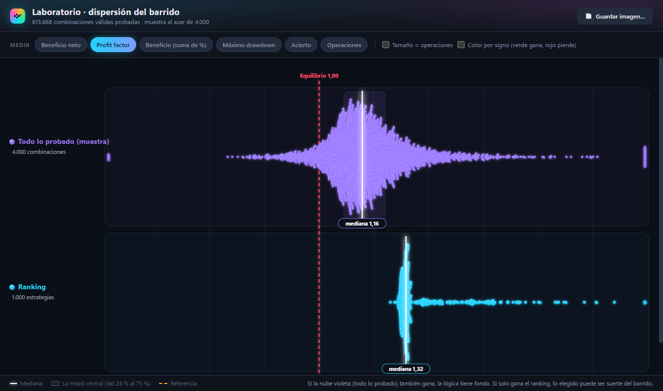
Two rows: a random sample of everything the sweep tested (up to 4,000 combinations, picked without bias while the sweep runs) and the ranking, what the sweep chose. Metrics: net profit, profit factor, profit as a sum of percentages, max drawdown, win rate and trades.
What to look at: if the violet cloud (everything tested) is also positive, the logic you are sweeping has substance and the ranking is the tip of something real. If only the ranking wins and the cloud is centred on losses, what was chosen may be the luck of trying hundreds of thousands of combinations.
The sample carries no names: in evaluation mode it does not reveal any hidden strategy.
Each cycle appears twice: in the IS row (the stretch where it was chosen) and in the OOS row (the stretch it never saw). Since the stretches have different lengths, the main metric is net profit per month, which makes them comparable. Also: net profit for the stretch, OOS/IS efficiency per month, max drawdown and trades.
What to look at: hover over a cycle and its IS joins its OOS, with the dates of each stretch. If the magenta cloud falls far to the left of the cyan one, what the Walk-Forward picks does not hold up out of sample.
The long and short edges, in two rows, with the same filter the gallery has at that moment. Metrics: Confidence, t-stat (with the t = 2 reference, significant), percentage of positive signals (with the «Coin toss» reference at 50%), signals and horizon in bars.
What to look at: if your edges pile up just above the coin toss, the library has more quantity than quality. Clicking a dot takes you to that edge's card in the gallery.
The active strategies (the ones that make up the portfolio) and the rest. Metrics: net profit, profit factor, max drawdown, profit as a sum of percentages, win rate and trades.
What to look at: if a single active dot sits far to the right and the others stay near zero, the portfolio is not diversified: it depends on that strategy. Run the portfolio before opening the window.
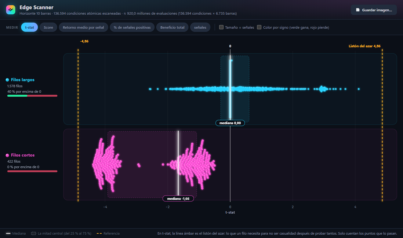
The edges found, long and short. On the t-stat metric two amber lines appear: the Chance bar (and its negative mirror), what an edge needs so as not to be a fluke after testing so many conditions. Other metrics: Score, average return per signal, percentage of positive signals, total profit and signals.
What to look at: only the dots that clear the bar count. It is normal for none to clear it: testing more than a hundred thousand conditions raises the bar a lot, and the chart shows how close or far the best one came.
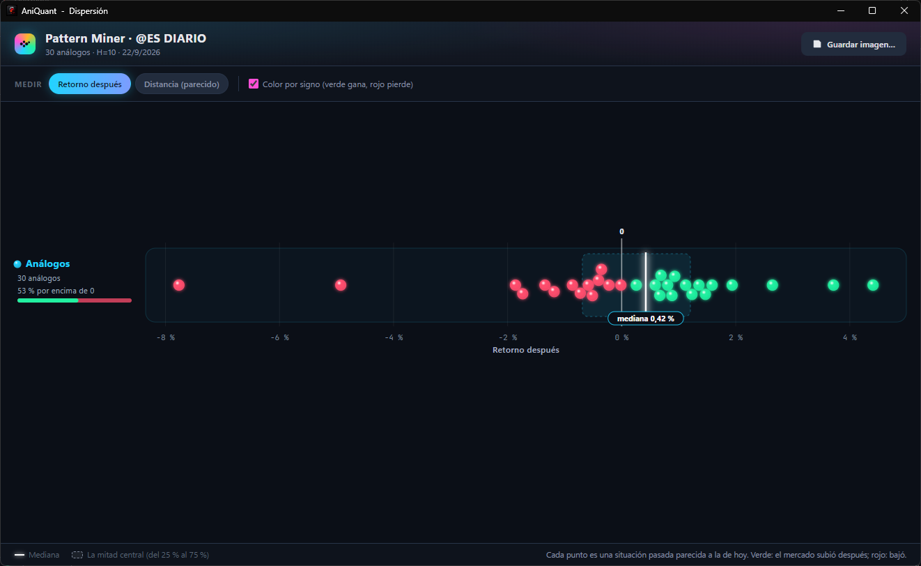
Each analogue (a moment in the past similar to today) is a dot. Metrics: the return afterwards, over the horizon you chose, and the distance, how similar it is to today. It comes with colour by sign: green if the market rose afterwards, red if it fell.
What to look at: not only how many are green (the percentage is shown on the left), but how much they weigh. Many small greens and a few big reds can give a negative average even though most of them win.
Each scanned stock is a dot, in two rows: those still listed and those that no longer exist (they went bankrupt, were taken over or were delisted). Main metric: the strategy's return on each one.
What to look at: a backtest run only on today's companies would see the top row. The bottom row is what survivorship bias hides. In a test with 400 stocks spread across the catalogue, the median was +15.5% for the survivors and +3.2% for the ones that disappeared.
Open its Dispersion. If the best strategy is surrounded by similar neighbours, you have an idea. If it stands alone, you have a number. And if you want to know what luck looks like in your market, create a shuffled market with AQ Market Shuffle, run the same search and compare the two dispersions.
AniQuant can be tried free for 14 days, with every module and no card. If you have the book, 30.